The Generalist has been interested in diagrams, maps and informational graphics since the days of An Index of Possibilities and our discovery of the work of Edward R. Tufte, described by the New York Times as the Leonardo of the subject.
Edward Tufte is Professor Emeritus of Political Science, Statistics, and Computer Science at Yale University. He wrote, designed, and self-published ‘The Visual Display of Quantitative Information’, ‘Envisioning Information’, ‘Visual Explanations’, and ‘Beautiful Evidence’. He has recently been appointed by President Obama to the Recovery Independent Advisory Panel, whose Mission Statement is: To promote accountability by coordinating and conducting oversight of Recovery funds to prevent fraud, waste, and abuse and to foster transparency on Recovery spending by providing the public with accurate, user-friendly information." It is the latter in which Tufte excels and is the acknowledged pioneer.

The other book that had a big influence on me is, I believe, less well known: ‘The Telling Image: The Changing Balance Between Pictures and Words in a Technological age’ by Duncan Davies with Diana and Robert Bathurst. [Clarendon Press. Oxford. 1990]Davies died before the project was completed and the Bathursts stepped in; their Preface acknowledges his foresight:
‘Duncan Davies saw that great and influential changes are taking place in society, as the balance of the means of communication tilts progressively from words and numbers towards pictures and images… [He] felt that too few people are aware of either the scale of the speed of this shift in the balance toward pictorial communication, or of the problems posed by the need to store and retrieve pictorial data, or of the possible consequences for the future. Adapting to this transformation would, he believed, require profound modification of attitudes, and of the ways in which we prepare the young through education.’
In the book’s first chapter, Davies summarises his historical perspective: ‘We have communicated with one another by sight and sound for several millions of years, also by touch, smell and taste… we have been able to record our experience, ideas, and messages, for only about thirty thousand years…’
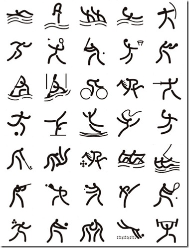
Above: Egyptian Hieroglyphics. Below: Pictograms from the Beijing Olympics.
‘There were about 250 centuries when we had pictures alone and could not learn how to use them generally and effectively. Next there were 20 centuries where we learnt how to use formalised pictures (pictograms and ideograms) as message carriers. There followed some 15 centuries or so during which clerks made the great leap forward of alphabetic reading and writing. During the next 5 centuries, reading and writing thrust picture-communication into the background. However, over the last one-third of the century [with the advent of tv and computers] the picture has suddenly and expansively become the main means for ‘reading’ and learning…’
One page of the book’s Visual Index that indicates some of the range of graphic approaches and subject matters.
David McCandless is both an expert practitioner and cheerleader for this important development in human communication, which is set to expand exponentially in the coming historical period and will help transform education and public information systems. ‘Information is Beautiful’ is a great place to begin to appreciate the vast possibilities offered by new graphic communication. McCandless also has a top-notch Information is Beautiful website - that develops out of the book and keeps a tab on graphic information work being done around the webosphere. Highly recommended. Get with the program.
See Previous Post: THE INFORMATION REVOLUTION: THE FOURTH PARADIGM
See Also: The Power of Visual Communication by Mike Parkinson


No comments:
Post a Comment